

(Above photo made using Kate Hadfield’s Scrapping 9 to 5 Doodles.)
It’s Christa again, and “Welcome Back“! I hope you have enjoyed “Bent Shadows / Bent Photo Frames – Part 1“. As promised, I am back with Part 2 which will explore the “Bent Shadows” using CS3, Creating a Layer, and the Warp tool. With using the warp tool in CS3 or later version of Photoshop you have more versatility where you can bend corners etc. We are also going to use the burn & dodge tool too, just for added realism!) This time we will be creating a sticker.
As you will see from making a bended sticker, you can use the warp tool to bend the shadow easily to create the bent shadows for a photo as we did in part 1 without all the extra steps of Marquee or Custom shape tool. All you will need to do is move some of the nodes around and you are all set!
In the sticker portion since we are dealing with a circle. To make it easier, I will be using “time on a clock” so you know how to maneuver the warp tool, and the burning and dodge tools for the correct directions.
Are you ready? Let’s go!!!
(We again will use some elements from Kate Hadfields Little Graduate as there is a perfect doodle for a sticker in there!)
We are going to make a sticker that bends up away from the paper in CS3 using the warp tool. In addition, I will also show you how to use the create layer in the layer palette after you have applied an effect to adjust it. The sticker will appear as if it didn’t fully “stick” for a great fun change.
- I made a quick background paper using flood fill with a light color and then applying a graph paper pattern fill. I also added some doodles around to make the screen shots more colorful as we go. I have selected the “Class of” round circle doodle and have used a font with open area for the year 2013. Use a font or an Alpha to have the doodle decorated a bit more to make it your own.

- First thing we do is add a shadow & stroke effect to the button.
- We are going to start with the stroke effect and I am doing them separately as I want to make sure the shadow will take the stroke area into consideration too. (Otherwise the shadow will not go out far enough to encompass the stroke.)
- Click on fx at the bottom of the layer palette to invoke the layer style.

-
Stroke size = 7, Position= outside, blend mode= Normal, opacity=100 and color= white ffffff
- Add a blank layer above the button. Select the blank layer, and while holding down the shift key, click on the button layer. Go to Layer > Merge layer to join them as one.
- Again, select button layer in the layer palette, then click on the fx button at the bottom of the layer palette and this time select drop shadow from the drop down list.

- Settings for drop shadow are: Blend mode= multiply, Opacity= 75%, Angle= 120 (global light checked), Distance=1, spread=0, size=8, contour and anti-alias is default, noise=0 and layer knocks out drop shadow checked.
- Great! Now we will split the shadow effect from the button layer.
- Select the effect drop shadow layer of the button, and right click with your mouse. This will bring up a drop down menu where you will select Create Layer. When you do this, it automatically splits the shadow from the button and places it on the layer beneath your element. (Button in this case). You no longer have any effects attached to the button.

- Now that they are separated, we are going to use the warp tool and bend the button label. Select the button sticker label in the layer palette. Go to Edit> Transform> Warp. It will then invoke a grid like image that you will use to transform the circle.

- We want this sticker to bend from the bottom right (4:00 position) to the Top left (11:00 position). To do this we will grab the bottom right node and move that node on the angle towards 11:00 slightly. The bend is up to you, but you want to make it look like it wasnt pasted all the way.

(Remember you can always undo or re-apply and try again until you get it looking as you want it to.)
- Now we are going to add some dodge & burn to make the button look more realistic in the bending area. This too is subject to taste. Always remember you can undo and re do until you get it just right!
- We are going to start with the burn tool, just burning a bit around the curled up area.
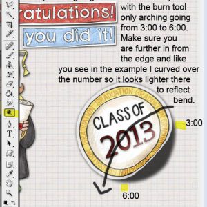
- Start the burning at the 6:00 position on the edge of the button up to the 3:00 position with the settings as noted in the screen shot. I did that twice and then an extra dot at 6 and one on 3, and then I just added a little bit of burn in the white area.

- Now we will add a highlight with the dodge tool.
- This time we will add the dodge in a curved arch going from the 3:00 to the 6:00 position counter clockwise. Make sure you go over the number like I did so you get the effect of the light. Settings are listed in the screen shot below.

- That really is all there is to it. If you want to lighten and Gaussian Blur the shadow you can do that to lighten a bit, just select that layer, go to Filter>Blur>Gaussian Blur and select your setting – I lightened the shadow a little, changing the opacity on the multiply blend mode to 77. (Fill was already at 75% from when it was split). I then added a Gaussian Blur of 3.9 to finish off my sticker.

- The things you can do are endless. I prefer doing bent edges and frames using the warp tool. Practice and play and soon you will be having fun doing some nifty things to spruce up your pages and making them a little bit more 3D.
Have fun! If there is anything you have questions on, give a shout and I will do my best to answer!
Stay tuned to Kate’s Blog for more tips & tricks to help you with your Digital Scrapping Layouts!


 Photoshop Tips: Bent Shadow / Bent Photo Frame – Part 1
You are welcome BlueCat! Can’t wait to see your layouts!
Thanks for this great tut.